Week 4 - Glossary of Terms

Updated: May 17, 2021

I have already covered most of the terms, so here are the ones that I didn't cover :
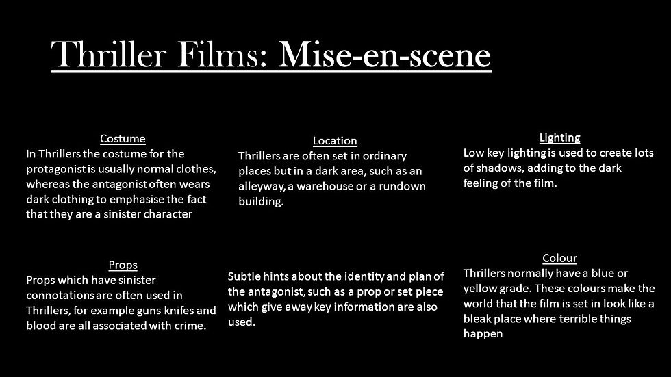
- Mis En Scene
- Types of Photography
- Typography
Mis En Scene :
Types of Photography in Thriller films :
High angled/Birds eye view :
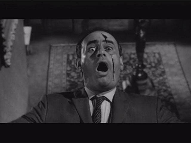
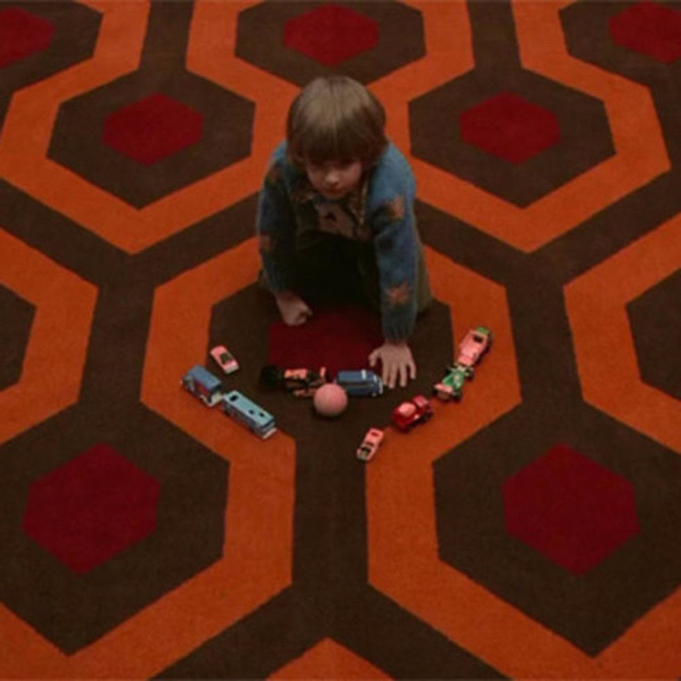
These shots are used especially in horror and thriller films to give the effect that whatever is being looked down on, appears to look powerless and vulnerable.
Close up shots :
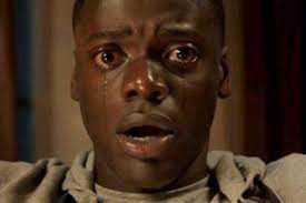

This camera angle is used to show what the characters reactions are to whatever is happening in the film and how they are feeling at that moment. It is also used to capture detail closely in a scene that is important in the film.
Over the shoulder shots :

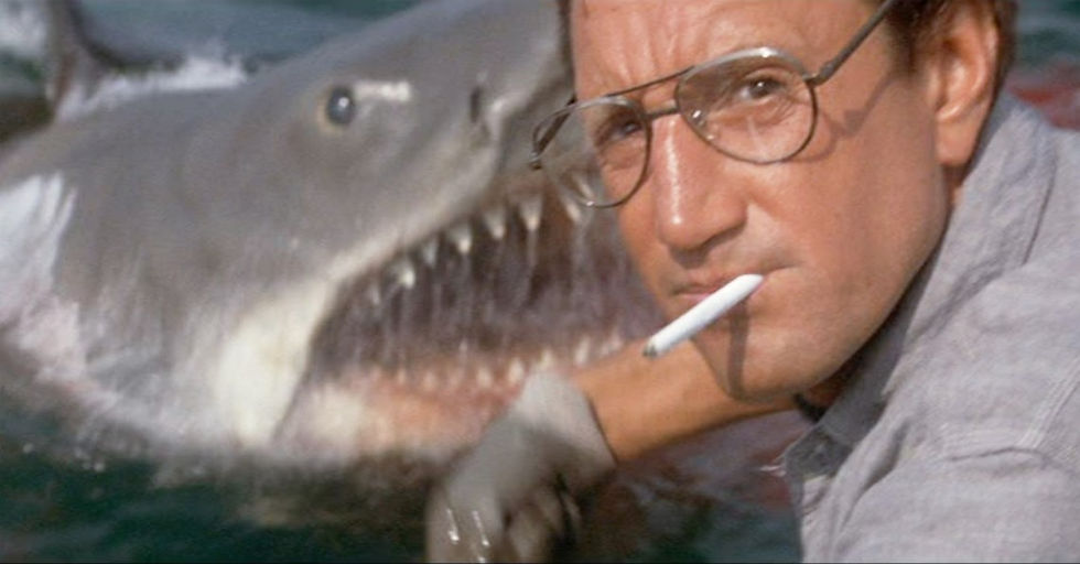
This is one of the best ways to build up tension and suspense. It is mostly used around mirrors and reflections so the audience can see everything as soon as the character does. For example, it is used often to show a figure stood behind the victim.
Zoom shots :

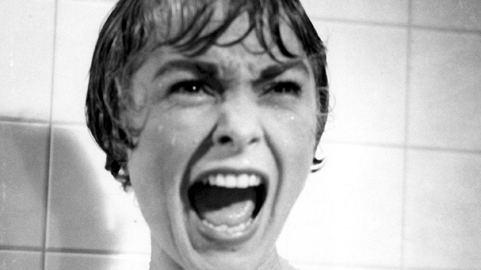
This gives a dramatic effect and helps to create suspense and fear of not knowing what's going to happen next. Its mostly used in these types of films to zoom into something gory or gruesome, or to see something a character in fear.
Tilted angle :
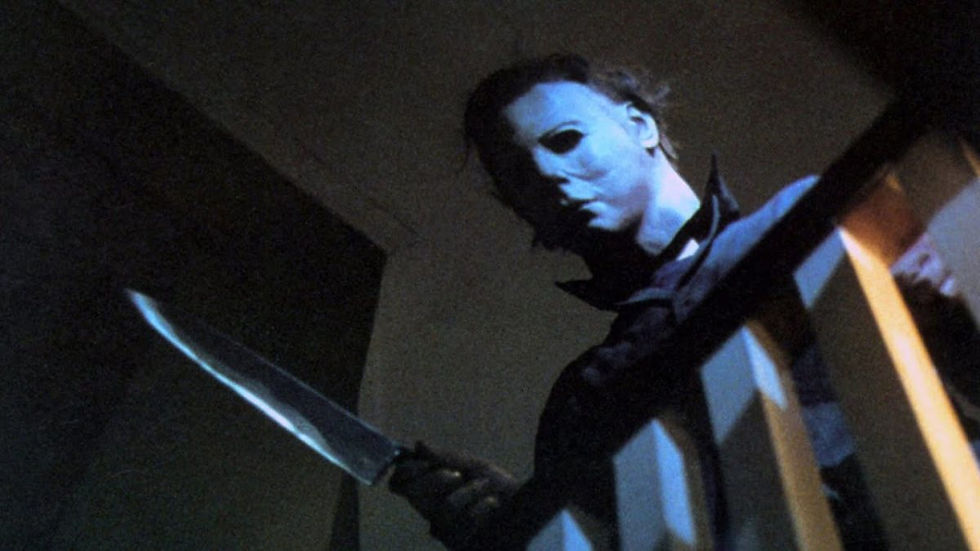
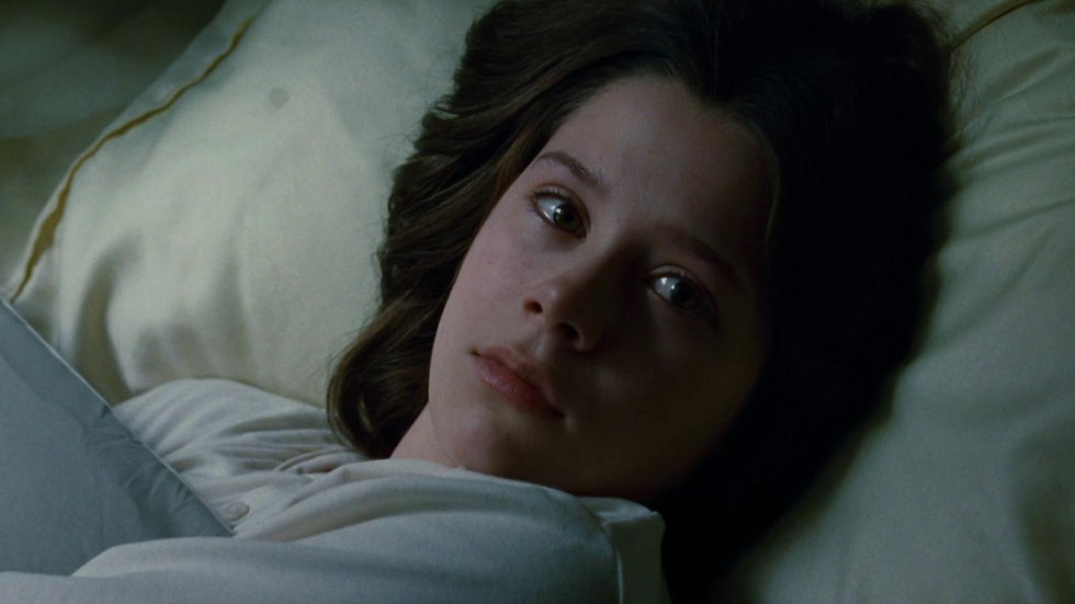
These add dramatic tension to the scene, and sometimes signify a supernatural beings pushing or moving the camera. It is also used to act as though the camera is the character that is the victim looking up at the villain, and the audience are seeing what they are seeing.
Types of Typography in Thriller films :
"Paranormal Activity" (2007 - 2014)
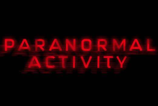
The colour of the text is red therefore signifying death, blood, etc. The text is on a black background, This helps the text stand out therefore drawing the attention of the audience to the text. The titles seem to be shaking giving an uneasy effect. The lines across the text help to make the text blurred therefore giving a ere effect. Again the text is all in capital letters and this helps the titles stand out.
"Se7en" (1995)
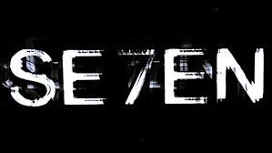
The typography in the film Se7en is white on a black background, this helps the letters look more striking and bold which helps them stand out so the audience will clearly be able to see the titles of the film. The footage used overlaps creating an ere feel to the movie. The titles are also shaking which again gives of an uneasy feeling to the audience. The letters seem to be broken apart which creates a sense of tension to the thriller film titles. The colour white signifies innocence, peace and purity. The colour black signifies death, evil and fear. these two colours are very opposite signifying different characters in the film.
Comments