Week 7 - My Final Film Poster

Updated: May 26, 2021

Film Analysis :


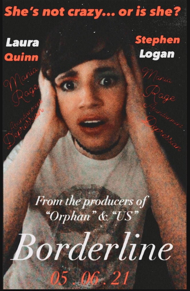
The opposite colours in the actor's names, are supposed to represent the personality disorder that the character in the poster is portraying
The fact that the colours are opposite, could also indicate how the personalities in BPD do not match

The tagline of "She's not crazy... or is she?", implicitly asks the audience a question and makes them wonder what the answer could be
The use of the question mark in the tagline, indicates a feeling of uncertainty or paranoia, these two emotions are symptoms of BPD (Borderline Personality Disorder)

The symptoms of BPD are listed at the side of the character, and are very tiny and very hard to notice.
The reason why the symptoms are barely noticeable in the poster, is due to the fact that BPD is hidden within the brain, and are only shown through physical acts.
The fact that the character is grasping their head with both hands indicates how people with BPD are in a constant battle with their emotions, and other people around them can't see the damage that it can cause.

Mentioning other films in the poster draws in the audience, because it potentially shows how the film could be good to watch
Side By Side Comparison : Real Poster VS My Design
Orphan (2009) Borderline (2021)

Similarities :
Both film posters show off the antagonist
Both film posters show off Thriller genre
Both film posters have white and red texts
Both film posters contain a film title and date
Both of the characters are wearing a choker
Both taglines are at the top of the poster
Differences :
The lighting for Orphan is more bright, whilst Borderline's lighting is more dark / mysterious
The girl in the Orphan poster is making an angry face, whilst the character in Borderline has a worried face
The film date for Borderline is large and bold, whilst the date for Orphan is small
The background for Borderline is black, whilst the background for Orphan is Green
Comments