Magazines Blog 6 - Content and Layout

Updated: Dec 16, 2020

1st & 2nd page - The interview with Trixie and Katya, with their answers
3rd & 4th page - Fashion expert Billie Newland telling us the best fashionwear and tips
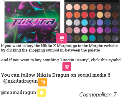
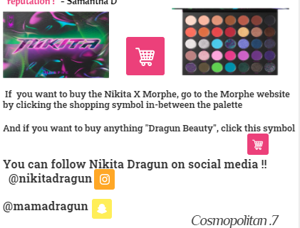
5th & 6th page - A look inside the Nikita Dragun X Morphe palette, with reviews
Back Cover - RuPaul's Drag Race UK Season 2 poster
Age range / Target Audience
Teens - Young adults
Anyone who likes fashion/beauty, and people who identify as LGBTQ
Reasons why i chose these people to go in the magazine
I chose Trixie and Katya because they are hilarious and iconic drag queens who have a massive fan base since competing on the 7th season of RuPaul's Drag Race.
I chose Billie Newland because she is a very popular Tik Tok artist and is considered one of the best fashion experts on social media today.
I chose Nikita Dragun because she is is a rising star in the beauty industry and the first ever transgender makeup brand producer
Page 1 & 2 walkthrough
First Page
1. Firstly, I took a screenshot of Trixie and Katya and then moved the image into the center of the magazine to catch the audience's attention.
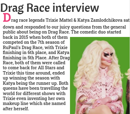
2. Straight after this, I added a text box with a subheading of DRAG RACE INTERVIEW. This highlighted Trixie and Katya's background on how they became a bff comedic duo.
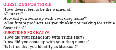
3. Furthermore, I added another text box of questions that I made up, and then separated them out into two sections: Questions for Trixie and Questions for Katya. I also made both subheadings different colours so that the audience can focus on more than one section.
Second Page
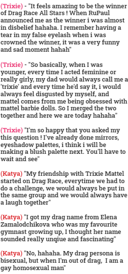
4. After doing that, I added yet another text box, this time featuring the made up responses from the questions. I also color coordinated Trixie and Katya in brackets (Trixie in pink and Katya in red) to let the audience know who said what, and then dragged the box to the right of the magazine.
5. After the answers, I added a shopping cart symbol for Trixie Cosmetics and a Spotify symbol to let the audience know that they can listen to Trixie Mattel on Spotify, and I placed this underneath the image of Trixie and Katya. I decided to change the size of the text so it catches the audience's attention.
6. Finally, I added Trixie's and Katya's social media platform right in the top right corner.
Page 3 & 4 walkthrough
First Page
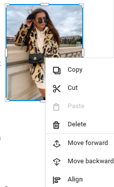
1. The first thing I did, was I found an image of Billie Newland on Google. Once I did this, I shrunk the image to make it fit into the magazine and then dragged the image to the right.
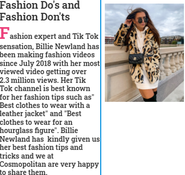
2. After this, I added a text box with the subheading of "FASHION DO'S AND FASHION DON'TS" (with it's font being "Roboto Slab") and then added a bunch of information about Billie Newland (e.g. her job as a fashion expert, and her Tik Tok channel getting over 2.3 Million views.
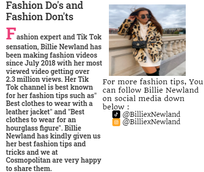
3. After adding all the information, I added another text box which highlighted all of Billie Newland's social media platforms.
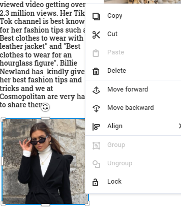
4. After adding the social media platforms, I screenshotted another image of Billie Newland and moved it to the left corner on the first page of the magazine.
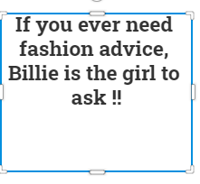
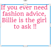
5. Furthermore, I added another text box in bold letters stating "IF YOU EVER NEED FASHION ADVICE, BILLIE IS THE GIRL TO ASK !!" and dragged it next to the second image of Billie. After looking back at my work, I decided to change the colour of the text box to pink. I thought doing this, would catch the reader's attention.
Second Page

6. After I finished that, I moved on to the fashion tips and added two text boxes stating Fashion Do's and Fashion Don'ts in a

hot pink colour and moved the do's to the top and the don'ts to the bottom.
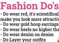
7. Furthermore, I did some research on Fashion Do's and Fashion Don'ts and stated as much as I could in each section.
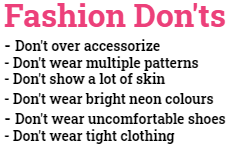
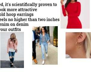
8. After this, I searched examples of Fashion Do's and Fashion Don'ts, took screenshots of them, and then uploaded them to the magazine to show the reader what exactly the do's and don'ts look like.
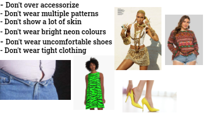

9. Moreover, I decided to add a tick and X mark to make the subheading stand out and catch the reader's attention.

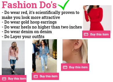
10. Finally, I added a buy this item symbol underneath all the fashion do's, and a link to buy the items.
Improvements
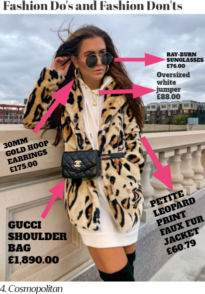
For my first improvement, I changed the title's font to "Abril Fatface". After this, I decided to remove the second image of Billie and then enlarge the original image to make it fit the entire page. In addition, I inserted some pink arrows on Billie's clothing explaining what everything was separately and how much each piece of clothing cost.
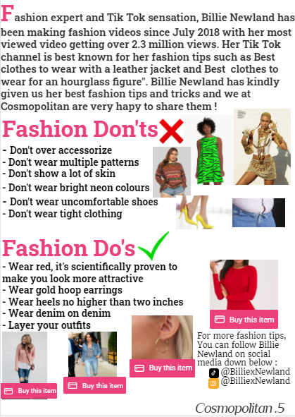
2. For my second improvement, I moved the text box that was originally on the first page to the second page, and then I added Billie's social media platforms (Instagram & Tik Tok) in the bottom right.
Page 5 & 6 walkthrough
First Page
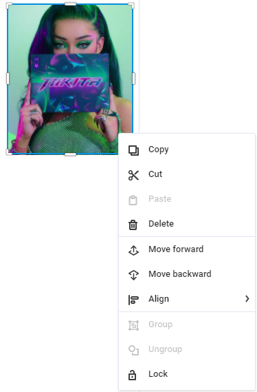
1. Firstly, I searched Nikita Dragun on Google, screenshotted the image, and then moved the image to the left corner of the magazine.
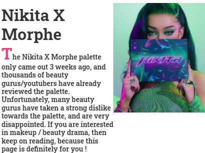
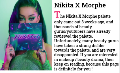
2. Once I finished that, I added a subheading of "Nikita X Morphe", and then a bunch of information about the new palette. Originally, the picture of Nikita was on the left with the information about the palette on the right. But I decided to switch their positions, because I think the magazine would look better if the picture was on the left.
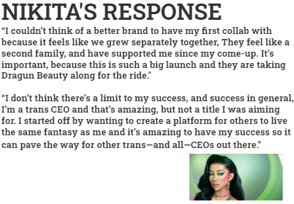
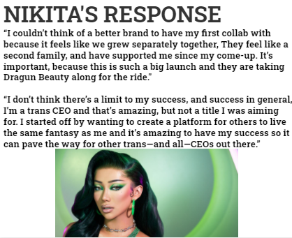
3. After this, I uploaded another picture of Nikita Dragun, shrunk the image and then dragged it to the bottom centre. Straight after that, I added another subheading of
"NIKITA'S RESPONSE" and did some research on Nikita's history with Morphe. After looking back at my work, I decided to change the image size by making it bigger and then moving the image right underneath the information.
Second Page
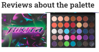
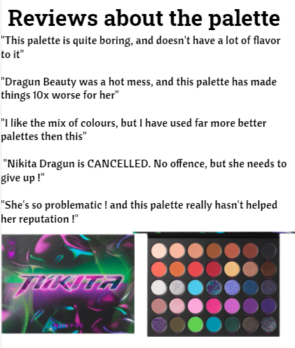
4. Furthermore, I added yet another text box with the subheading of "REVIEWS ABOUT THE PALETTE". Underneath the subheading is a picture of the outside and inside of the Nikita X Morphe Palette.
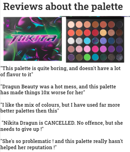
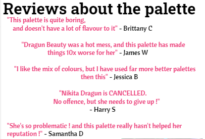
5. Moving on, I did some research for the reviews of the palette and then added them underneath the palette. After looking back at my work, I decided to move the reviews to the top and have the palette at the bottom at the screen, and I also decided to change the font style of the reviews to make it stand out and catch the readers attention. Once I finished that, I decided to change the colour of the reviews to pink and add generic names to the reviews. I thought doing this would interest the reader because then they can see what other people think about the palette.
6. Once I did that, I added a shopping cart symbol for Nikita's other makeup brand called "Dragun Beauty", this lets the audience know that they don't have to be the one item, they can buy other things as well, and Nikita Dragun's social media platforms (Instagram and Snapchat)
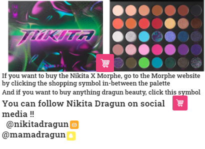
7. Furthermore, I added another shopping cart symbol and moved it into the centre of the palette to let the audience know that the item is purchasable. After this, I moved the social media platforms (with the links) to the bottom left. After looking back at my work, I decided to enlarge the shopping cart symbol and then place it right in-between the palette to it splits in half.
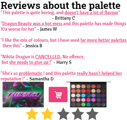
8. Once I finished that, I underlined specific words in the reviews to really get the opinions across. After this, to make the review more realistic, I added 5 stars with 2 only shaded in.
9. For my final improvement, I decided to add a text box asking the audience a question on the palette. I thought doing this, would include the reader and make them feel involved and give them the power to voice their own opinion
Back Cover
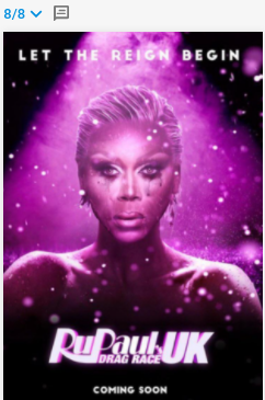
1. For the back cover, I decided to go with the poster from RuPaul's Drag Race UK Season 2. I thought doing this, would attract the LGBTQ audience
Additional Info
I added page numbers to keep the reader organized



Final Reflection
What did you hope to achieve?
I hoped to achieve a realistic looking magazine, and I think I did a good job
What were the reasons for the changes?
I decided to change some stuff around, because I felt like some things looked better in different positions, such as the Nikita picture, the reviews
What part of the project was the most successful and you are most proud of?
The most successful part of the project was designing page 4 and 5, I definitely think those two pages look better then the rest. I'm most proud of creating the front cover for the magazine, because due to the fact that I had to use Photoshop, I thought I was going to automatically fail, but it turned out better then what I expected.
What areas do you think need further development and you would change?
I think the areas that need the most development would have to be the social media mentions, I would've probably make them bigger and more noticeable. (IMPROVEMENT) I made the social media platforms bigger
What would you do differently if you repeated the project in the future?
If I had to repeat the project in the future, the one thing that I would do differently would have to be the pictures, I wish I could have made them look less stretchy
How did you communicate with the audience?
I communicated with the audience in a whole different ways. Firstly, I included an interview on the first page which included questions from the general public. Secondly, I added links to Billie Newland's social media and links to the specific clothing which was on display. Thirdly, on page 6 & 7, I included a review of the palette and links to Nikita's Dragun social media, Morphe website, Nikita's own makeup line "Dragun Beauty", and I included a text box which asked the audience a question

Comments