Film Promotion Blog 8 - Planning and Final Poster

Updated: Feb 10, 2021

After taking multiple photos, I chose my best two. After a couple of minutes, I decided to choose the image on the left. As you can tell in the pictures, due to the use of black & white, I wanted my film poster to be old fashioned and almost similar to the 1960 film "Psycho"
To edit the picture, I decided to use an app on my phone called "PicsArt". I decided to use this, because the app is very similar to Photoshop, and it's way easier to access. The reason why I chose not to use Photopea, Pixlr etc. was because I don't consider myself that advanced, so I stayed in my comfort zone.

Here is a screenshot of me using "PicsArt". As an improvement, I decided to add a filter which was called "1971", this gave my picture a Serpia Effect. After that, I moved on to the Typopgraphy and stickers. I chose a font which was called "Vacer Sans" and then I added a barcode and 15 age rating.


After looking back at my work, something just didn't feel right and I wanted to change it. So I went back to "PicsArt" to add a slogan of "Danger Disguised by Beauty", I used the same font (Vacer Sans) to do this. After I completed that, I went to Photos on my phone and I decided to change the filter to "Dramatic Cool", and change the saturation of the picture to make it look darker and more scarier.

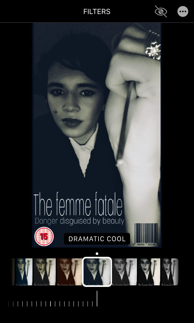

Here is my final film poster. Hope you like it !!


Comments